Well, I expect you’ve probably guessed it by now, but Visualisations and Infographics are definitely not the same thing, although they certainly share some significant similarities, and are very often used interchangeably by most people.
I want to be clear that I am coming at this topic from the perspective of an “Information Professional”, as opposed to from a general public point of view. I am being deliberately pedantic to ensure complete clarity, and am definitely not trying to undermine anyone else’s interpretation of these two words!
So, onward we go!
The first thing to note about Visualisations and Infographics is their main similarity, that being their aim. Both of these visual tools seek to communicate what can often be complex information sets via a more easily digestible visual medium.
The key difference is that whilst Visualisations are primarily concerned with Data, Infographics deal with Ideas.
It really is that simple.
Whilst both work through the medium of an image, they are resourcing the creation of that image through two basically opposing sources.
Visualisations are based on numbers, often large and complex data sets that can be numerically compared and which can then set down this comparison into a visually appealing image. Something computers can do very well, whilst we tend to struggle with creating accurately. They can be easily repeated or compared across similar data sets and should not be subject to perspective or bias. They are computer rendered.
Infographics on the other hand are concept based. Their purpose is to take a potentially extremely complicated process, relationship or structure and clarify it diagrammatically so that it can be more easily understood or followed by the average person such as you or I. This is a job for humans and one which computers tend to struggle a lot more with, why? Well, because it requires that still very human attribute of imagination. They are human designed.
One of the best ways of thinking about this, in my view, is to consider that whilst an Infographic may contain one or more visualisations, a visualisation cannot contain an infographic…
Anyway, that’s my perspective on the matter. I include a couple of examples of each type of image below, which is probably far more helpful than the descriptions I offer above!
(Please do click on any image below to see it in all it’s full scale glory!)
Visualisations


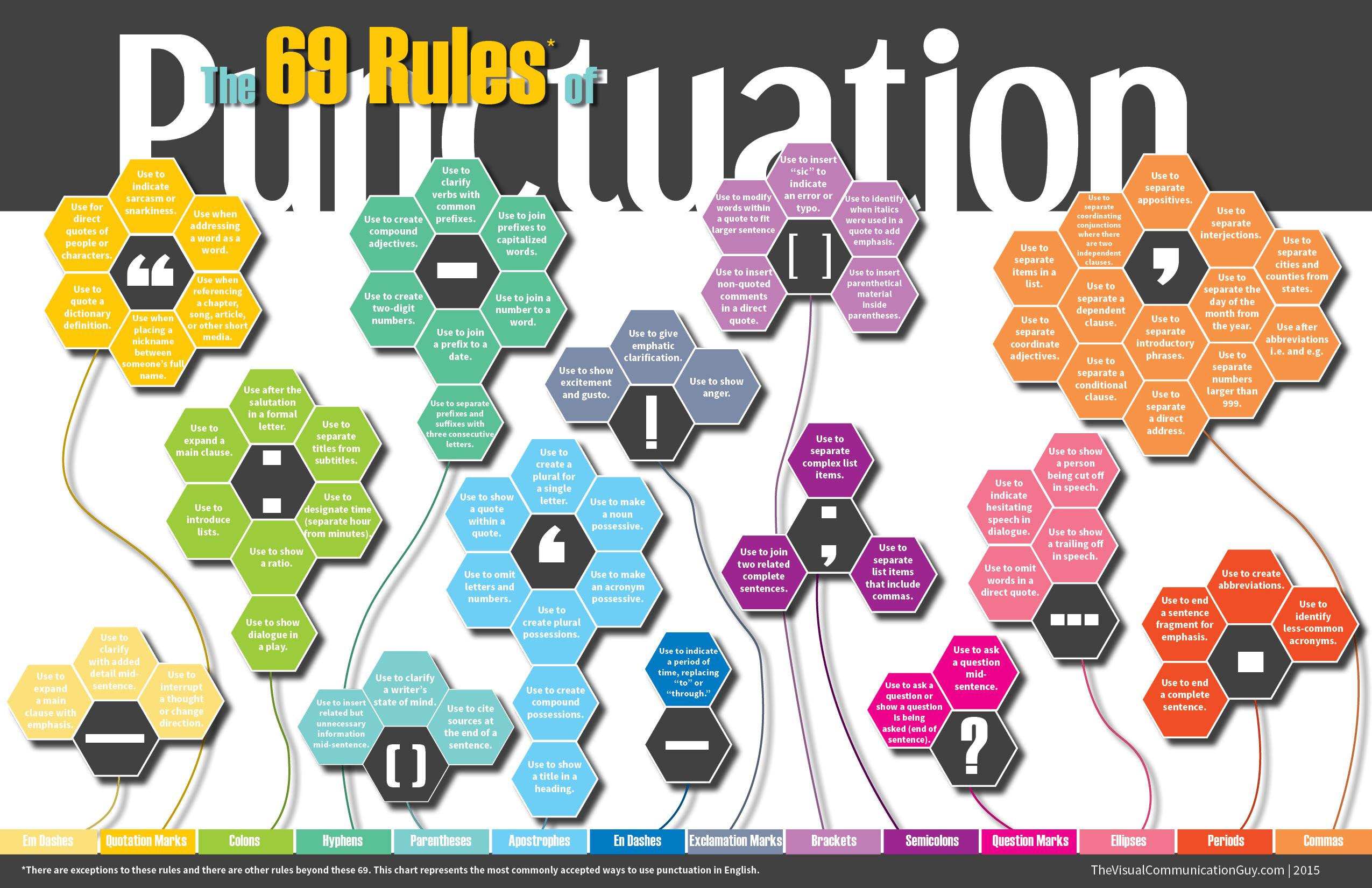
Infographics


Infographics Containing Visualisations


How NOT to visually represent Information!
Oh, and just in case you’d like to learn some lessons from others, here’s a great guide on how NOT to do Visualisation! 🙂